Windows Screenshot Tool for UX Designers: How to Review UI and Share Design Feedback
Where a Windows Screenshot Tool Fits in a UX Designer’s Workflow
A Windows screenshot tool fits into a UX designer’s workflow when visual feedback needs to be more precise than a written comment. Designers often review details that are difficult to explain in text alone: spacing between elements, button alignment, typography balance, visual hierarchy, empty states, hover states, modal windows, form errors, and responsive layouts. A clear screenshot helps the team see the exact UI detail instead of guessing what the designer means.
For simple captures, a built-in Windows screen snipping tool or a basic Microsoft screen capture tool can be enough. A designer can quickly capture part of the screen and send it to a developer, product manager, or client. But daily UI review usually needs a cleaner workflow: capture the right area, mark the visual issue, add a short note, and keep the feedback focused on one design detail.
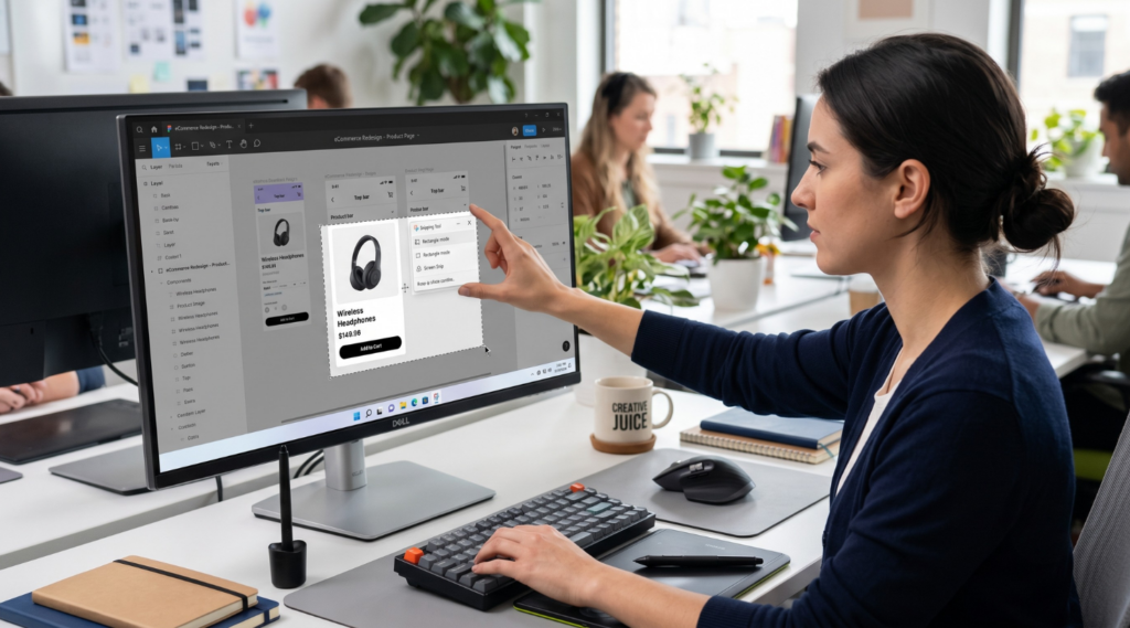
This is where a practical Windows screen capture tool becomes useful for UX work. Instead of saving a full desktop screenshot with too much visual noise, a designer can capture only the relevant component, screen state, or layout section. For example, the screenshot may show that a CTA has too little breathing room, a card layout feels uneven, or a form label does not align with the input field.
For UX designers, the real value of Windows screen capture software is not just saving an image. The tool should make design feedback easier to understand: arrows for pointing to a specific element, highlights for visual focus, text notes for short comments, and blur when unrelated information should stay out of the review.
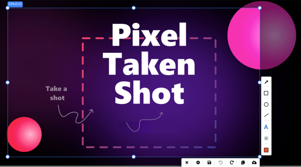
PixelTaken can also fit this workflow as a separate screenshot tool for designers who want to capture UI details and prepare quick visual comments outside the built-in Windows options.
Capturing the Right UI State in a Windows Screenshot Before Sharing Feedback
A useful Windows screenshot for UX review should capture the interface at the exact moment when the design problem appears. Many UI issues are not visible on a clean default screen. They appear only after a user opens a menu, enters data, triggers an error, resizes the browser, or interacts with a specific element.
For example, a signup form may look clean when all fields are empty. But after a user enters an invalid email, the error message may push the CTA too far down or make the form feel visually crowded. In this case, the designer should capture the form with the filled field, validation message, helper text, and button visible in one frame. This gives the team enough context to adjust spacing, message placement, or button position.
Another common scenario is a dropdown or filter menu. A closed dropdown does not show whether the options are readable, whether the menu overlaps nearby content, or whether long labels break the layout. A designer can use a Windows screenshot capture tool to capture the dropdown while it is open and highlight the exact area where the menu feels too wide, too compressed, or visually disconnected from the field.
Responsive layouts are another case where the right state matters. A page may look good on desktop width but become unbalanced when cards stack, columns collapse, or buttons move below the fold. Instead of sending a general comment about the mobile version, the designer can create UI review screenshots at the exact breakpoint where the layout starts to fail. This helps the team understand whether the issue is related to spacing, content wrapping, card order, or CTA placement.
Real content can also change the way a design feels. A dashboard card with short placeholder text may look perfect in Figma, but real product data can make it crowded: long labels, large numbers, status badges, and tooltips may compete for attention. In this case, the screenshot should include the full card and nearby elements, so the designer can point out whether the problem is hierarchy, density, or alignment.
The same applies to onboarding hints, modals, and tooltips. A tooltip may look fine as a separate component, but cover important content when placed inside the real interface. A modal may feel balanced with short copy, but become too heavy when real instructions, buttons, and secondary links are added. Capturing these states as design feedback screenshots allows the designer to show the actual visual condition, not just describe the component in isolation.
This approach keeps design feedback specific. The screenshot should not only show what is wrong, but also give enough surrounding context to understand why it feels wrong. For UX designers, that usually means capturing the active state, real content, nearby elements, and the exact layout condition where the design decision needs to be reviewed.
Using Annotated Screenshots to Explain Spacing, Alignment, and Visual Hierarchy
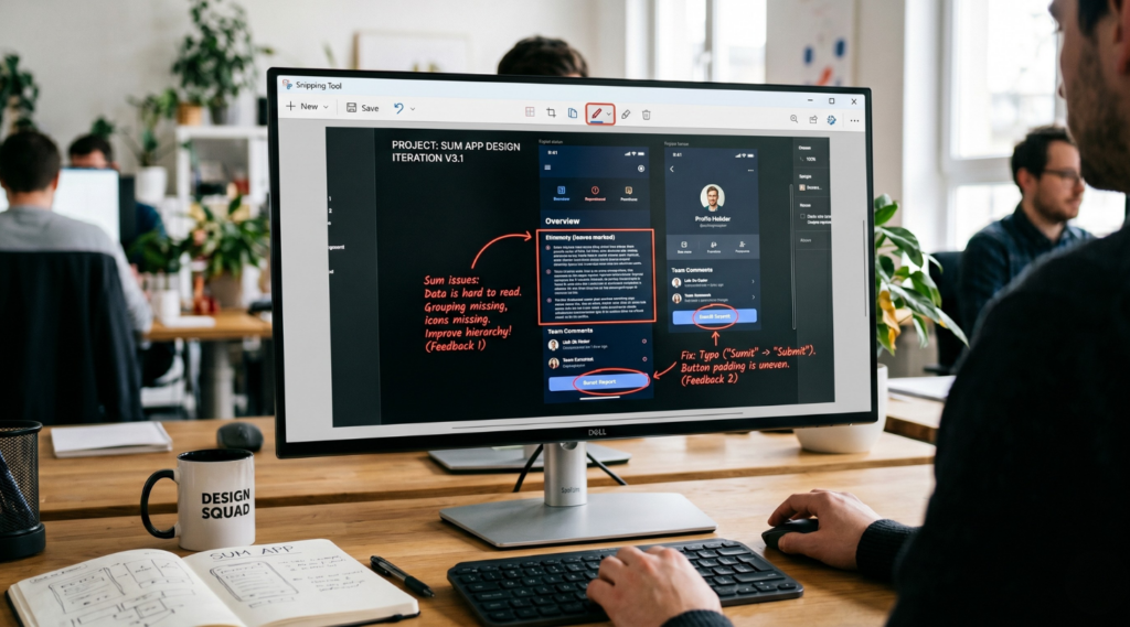
For UX designers, annotated screenshots are often more useful than long written comments because many UI issues depend on small visual details. Spacing, alignment, hierarchy, component balance, and visual focus are difficult to explain clearly without showing the exact area of the interface. A Windows screenshot tool with annotation features can help designers turn a general observation into a specific visual note.
Spacing is one of the most common cases for UI review screenshots. A card may have inconsistent padding, a CTA may sit too close to supporting text, or a form may feel crowded after helper copy and validation messages appear. Instead of writing a long explanation, the designer can capture the relevant section of the screen and mark the problem with a rectangle, line, or short text note. This makes the feedback easier to understand because the team can see which part of the layout needs more breathing room.
Alignment issues also become clearer through design feedback screenshots. In a live interface, a label may not line up with an input field, an icon may feel visually higher than the text, or cards in a grid may look uneven when one title wraps into two lines. A screenshot annotation tool allows the designer to point to the exact mismatch with arrows, lines, or highlighted areas instead of using vague comments like “this looks off.”
Visual hierarchy can be reviewed in the same way. Sometimes the interface works correctly, but the wrong element gets too much attention. A secondary button may look stronger than the main CTA, a warning message may blend into the page, or a headline may not stand out from the supporting copy. With annotated screenshots, UX designers can highlight the element that competes for attention and add a short note explaining what should feel more prominent.
PixelTaken can be a good alternative to built-in Windows tools for this kind of UI design feedback. A basic Windows screen snipping workflow may be enough for quick captures, but designers who need a separate Windows screen capture app for UI comments may benefit from built-in annotation features. PixelTaken lets users add arrows, rectangles, circles, lines, text notes, drawing marks, and blur or pixelation after capture. These features help keep feedback visual and focused without turning every UI comment into a long written explanation.
For example, when reviewing a pricing section, a designer can capture the card layout and use a rectangle to show where a long plan name breaks the rhythm of the grid. If the issue is about a form, they can use an arrow to point to the helper text and a line to show that the label and input are not visually aligned. If the screenshot contains customer names, emails, or internal dashboard numbers, blur or pixelation can hide unrelated details while keeping the design issue visible.
This is where Windows screen capture software becomes useful for design review, not just for saving images. The goal is not to annotate every part of the screenshot. The goal is to show one visual problem clearly: where the spacing changes, where alignment breaks, where hierarchy feels weak, or where a component looks different from the approved design.
A practical screen capture Windows workflow for UX designers should keep annotations simple: one marked area, one short note, and enough surrounding context to understand the design issue. The goal is not to decorate the screenshot, but to make the visual feedback faster to read and easier to act on.
When used this way, design feedback screenshots become clear UI review notes. They help designers explain spacing, alignment, and visual hierarchy with enough context for developers, product managers, or clients to understand what needs to change.
Comparing Figma Designs with Live Product Screenshots
A Figma design and a live product screen are not always identical, even when the implementation is technically correct. Browsers render fonts, spacing, icons, line-height, breakpoints, and dynamic content inside real constraints. That is why UX designers often need live product screenshots to compare the approved design with what users actually see in the browser.
This comparison should not be treated as a “pixel-perfect” inspection in every case. Small rendering differences can be normal, especially across browsers, operating systems, zoom levels, and screen densities. The more important question is whether the live interface keeps the same visual hierarchy, spacing rhythm, readability, and interaction logic as the approved design.
A Windows screenshot tool is useful here because the designer can capture the real product state and compare it with the Figma frame side by side. Instead of relying on a general comment like “this does not match the design,” the screenshot can show where the difference appears and whether it affects the actual user experience.
| What to compare | Common live product issue | What the screenshot should show |
| Typography and text wrapping | Text may look heavier, lighter, taller, or wrap differently than in Figma | The full text block with nearby labels, buttons, or supporting copy |
| Spacing and alignment | Padding, margins, icons, inputs, or cards may feel visually inconsistent | The full component area with enough surrounding UI for comparison |
| Visual hierarchy | A secondary button, warning, or supporting element may compete with the main action | The section where the user needs to understand what to do next |
| Responsive behavior | Cards, columns, navigation, or CTAs may shift awkwardly at real browser widths | The exact screen size or breakpoint where the layout starts to fail |
| Real content and UI states | Long names, numbers, validation messages, hover states, or loading states may change the layout | The live interface with realistic data or the active state visible |
After the main comparison points are clear, the next step is to make the screenshot reliable for review. A Windows screenshot tool should capture the live product under the same conditions the team wants to evaluate: the same browser width, the same zoom level, the same product state, and preferably realistic content. Otherwise, the team may discuss a mismatch that comes from the testing setup rather than the interface itself.
For example, if a designer compares a Figma desktop frame with a live product opened at 90% browser zoom, spacing and typography may look different for the wrong reason. If the issue appears only after a user adds long text or triggers an error message, the screenshot should show that exact state instead of a clean default screen.
This makes UI review screenshots more reliable. The designer can attach the screenshot to a design task and explain the difference in one focused comment: “The live card uses the correct structure, but the title wraps earlier than expected,” or “The primary action loses visual priority when the secondary button appears next to it.” The screenshot becomes a reference point, not just an image.
How a Windows Screenshot Tool Helps Turn Design Feedback into Clear Team Tasks
A design comment becomes easier to process when it is written as a task, not as a loose visual opinion. A Windows screenshot tool can help UX designers create that task context faster: the screenshot shows the exact screen, while the task description explains what should happen next.
For UX teams, the screenshot should not work alone. It should support a clear task structure. A useful design task usually includes the affected screen, the user state, the component involved, the expected adjustment, and the reason behind the change. Without this structure, even good design feedback screenshots can turn into vague requests like “make this cleaner” or “fix the layout.”
A better task format is more specific:
Screen: Account settings page
State: Password reset form after validation error
Issue: Error message pushes the secondary action too close to the input field
Expected result: Keep enough spacing between the error text and the secondary action so the form remains readable
Priority: Medium, because it affects only the error state but appears in a sensitive user flow
This kind of format helps the team understand not only what looks wrong, but also how important the issue is. A small visual inconsistency in a rarely used settings screen should not be treated the same way as a weak CTA on a payment step. Screenshots help show the issue, but the task should also explain the impact.
A practical screen capture Windows workflow for UX tasks can include a few rules:
- add the screen name or feature name to the task title;
- mention the state shown in the screenshot, such as error, empty, loading, selected, or mobile breakpoint;
- describe the expected result in one or two sentences;
- define whether the change affects one screen or a reusable component;
- attach a new screenshot after the fix is implemented.
The last point is important. Screenshots can help not only when opening a design task, but also when closing it. After the developer updates the UI, the designer can compare the new screen with the original task screenshot and confirm whether the issue is resolved. This creates a simple before-and-after review without turning the process into a long design audit.
A Windows screen capture software workflow can also make recurring feedback easier to manage. For example, if the same button spacing issue appears in several parts of the product, the designer can create one main task for the reusable component and attach screenshots from different screens as examples. This helps the team avoid fixing the same issue page by page when the real problem belongs to the component system.
When the issue depends on motion, a Windows screen recorder tool can support the task better than a static image alone. This is especially useful for hover states, sticky elements, dropdown behavior, tooltip timing, scroll effects, or multi-step interactions where the problem appears only during movement. In this case, the screenshot can document the final state, while a short recording shows how the user gets there.
Expert note:
PixelTaken can be a useful alternative to built-in Windows tools when a screenshot needs to become part of a team task, not just a quick image. In UX workflows, the screenshot often has to travel from the designer’s screen into Jira, ClickUp, Slack, Notion, or a review document. PixelTaken helps keep that visual reference clean and focused before it is shared, so the team receives a task-ready screenshot instead of a raw desktop capture.
This is especially useful when the designer wants to separate the UI issue from everything around it. A screenshot for a task should not include unnecessary browser tabs, unrelated dashboard data, private account details, or a full desktop when only one component matters. In this context, PixelTaken works well as a lightweight preparation step between noticing a design issue and adding it to the team’s workflow.